
With over 6.9% of websites worldwide now using React for building their frontends, it’s undoubtedly a great platform. However, it has left one persistent challenge for React developers: how to manage styles effectively. Also, traditional CSS, while powerful, doesn’t naturally align with component-based development. Moreover, as applications scale, working styles and maintaining consistency across components can become tedious.
That’s where CSS in JS can help. By writing CSS directly within JavaScript, developers can co locate styles with components and avoid common pitfalls like class name collisions. Furthermore, Emotion stands out as a robust and developer friendly solution.
Also, Emotion offers the best of both worlds, powerful styling capabilities, and the ergonomics developers love. So, in this guide, we will discuss what Emotion is and the best practices that can help you write maintainable and scalable styles in React applications.
What is Emotion in React?

Emotion is a flexible library for styling React applications using techniques known as CSS in JSS. Moreover, Emotion enables developers to create styles directly within TypeScript scripts rather than creating them in separate .css files. Additionally, managing and maintaining UI code is made simpler by the colocation of styles and components, particularly in big and intricate projects. Furthermore, Emotion offers powerful developer ergonomics and runtime styling features, integrating smoothly with React.
Moreover, Emotion supports writing styles using JavaScript syntax, which means you can use variables and conditional logic to generate styles dynamically. Hence, this is particularly useful for creating responsive or state dependent UI elements.
Styling Approaches in Emotion
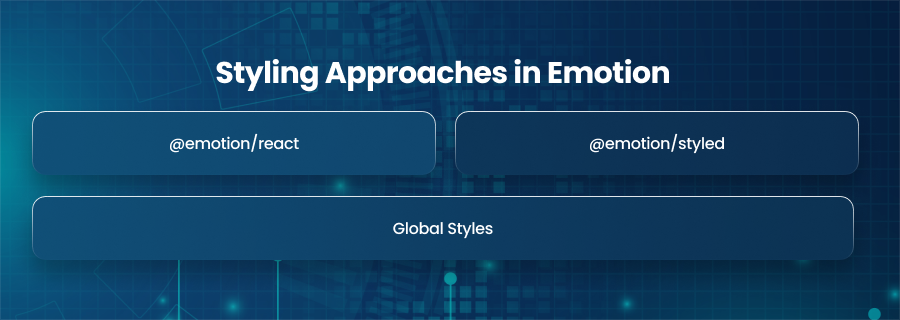
@emotion/react
This package is the foundation for using Emotion in React. Additionally, it offers the css function and css prop, which allow JSX items to be styled inline. Additionally, it has tools like the ThemeProvider for consistent theming and the Global component for introducing global styles throughout the application. For developers who would rather work with styles directly within component markup, this package is perfect.
@emotion/styled
Additionally, this package provides an API akin to the well known styled-components library. Additionally, it enables you to use template literals that mimic conventional CSS syntax to generate stylized components. You can create self contained, reusable UI components that capture their styles using @emotion/styled. Additionally, this method encourages readability and uniformity, particularly when creating design systems or component libraries.
Global Styles
While Emotion emphasizes scoped and component level styles, it also provides a clean and structured way to define global styles using the Global component from @emotion/react. Moreover, this approach is crucial for applying base level styles that need to affect the entire application, such as font imports and CSS resets.
Furthermore, the Global component accepts a style block written using the css utility and injects it into the global stylesheet. It’s typically used at the root of your app. Moreover, it’s often used within the top level layout or inside your main App component. Also, you can use this to set font families or define a universal box sizing rule.
Why use Emotion in React?
Emotion provides several benefits that make it a preferred choice among React developers. First, it ensures that all styles are scoped to the components they belong to, which avoids conflicts and keeps styling modular.
Next, it allows for dynamic styling based on props or component state. Hence, this enables greater flexibility and responsiveness in your UI.
Furthermore, it uses optimized runtime behavior and can even support zero runtime builds when developers use it with Babel macros or the Emotion compiler. Features like source maps and integration with browser dev tools can enhance the development experience.
Theming with Emotion
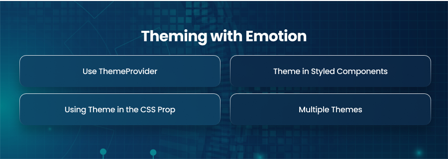
Use ThemeProvider
Emotion enables theming through a component called ThemeProvider. It wraps around your React application. Also, when you use ThemeProvider, you pass it a theme object that holds all your design tokens. Moreover, once wrapped, every styled component and style block inside your app can access this theme object. Furthermore, this eliminates the need to hard code values like color codes or spacing units repeatedly across different components.
Theme in Styled Components
When you are using styled components with Emotion, the theme object becomes automatically available to all of them. Additionally, it enables you to directly utilize theme data in your component styles, including font settings. It also guarantees that the same standards are used in the construction of every component of your user interface.
Using Theme in the CSS Prop
The css prop approach in Emotion also supports theming. Applying dynamic styles is also possible by gaining access to the theme object within the CSS prop. Additionally, this is especially helpful when you want to maintain consistency with the global design system while designing pieces on the fly. Therefore, Emotion’s theme support guarantees that all styles stay consistent, whether you’re creating a big layout or a little widget.
Multiple Themes
The ability to easily deploy different themes is one of Emotion’s theming system’s main features. Additionally, by designing unique theme objects for each mode, you may switch between them based on user preferences. Additionally, this is especially beneficial for improving accessibility. Also, it offers customers a personalized experience. Furthermore, Emotion effortlessly handles this by altering the styles across your application if the currently active theme changes.
Best Practices for Using Emotion
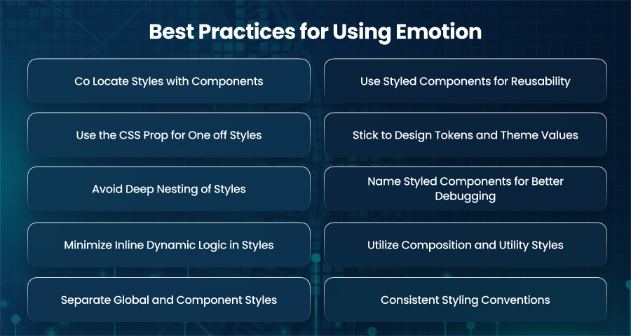
Co Locate Styles with Components
One of the biggest advantages of Emotion is the ability to keep styles close to the components they belong to. Moreover, this practice, known as co location, improves readability and helps reduce context switching. Therefore, combining styles and logic into a single file makes it easier to understand a component’s whole function. Additionally, because you don’t have to travel through several files to alter a component’s appearance, it expedites future adjustments.
Use Styled Components for Reusability
If you use styled elements in multiple places or need to support theming and props, it’s best to define them using the styled component approach. Also, styled components help encapsulate styles and make your design system more structured. Furthermore, defining components like buttons or form elements this way ensures consistency. Moreover, it reduces duplicated styles across your application.
Use the CSS Prop for One off Styles
The css prop is ideal for small, one time styling needs where creating an entire styled component would be necessary. Moreover, it’s best used for quick visual tweaks or conditional styles based on local logic. However, overusing the css prop, especially with large or complex style blocks, can reduce code clarity.
Stick to Design Tokens and Theme Values
Always utilize design tokens or values specified in your theme instead of hardcoding variables like hex colors or pixel sizes to preserve a consistent visual language. Applying different themes and managing design modifications is also made simpler by this. Using named color variables from your theme, for instance, guarantees that you only need to update your brand colors in one location in the event that they change.
Avoid Deep Nesting of Styles
It’s typically better to avoid heavily nested selectors in Emotion, even if it could be tempting to do so in order to emulate CSS preprocessors like Sass. Deep layering can also result in styles that are fragile and confused very rapidly. Instead, favor flat, descriptive styles that reflect component structure clearly. Furthermore, keeping styles shallow improves maintainability and makes debugging much easier.
Name Styled Components for Better Debugging
Emotion automatically generates class names, but giving meaningful names to styled components greatly improves the debugging experience. Additionally, this facilitates element inspection in browser development tools, particularly for big apps. Moreover, named components facilitate the tracking of styles’ origins and provide a quick understanding of their function.
Minimize Inline Dynamic Logic in Styles
Emotion supports dynamic styles based on props or state, but it’s important to use this feature. So, writing complex inline logic directly inside your style definitions can reduce readability and impact performance. Also, a better approach is to extract conditional values or computations into helper functions or variables before applying them.
Utilize Composition and Utility Styles
For common layout patterns or visual treatments, you can consider creating reusable utility styles or composing styles using shared functions. Also, Emotion supports composition, so you can build small and reusable style snippets that you can share across components. This improves code reuse and saves time when building new UI elements.
Separate Global and Component Styles
Use Emotion’s global styling only for foundational rules like resetting margins or applying background colors. Avoid placing component specific styles in global declarations. Also, you should keep global styles minimal to ensure you don’t accidentally introduce conflicts or override the scoped styles.
Consistent Styling Conventions
To keep your codebase consistent in style, use theme values and component names consistently. Being consistent makes it easier to operate as a team and onboard new developers. Clearly define the rules for applying theme values, using the CSS prop, and using styled components.
Use Cases of React Emotion
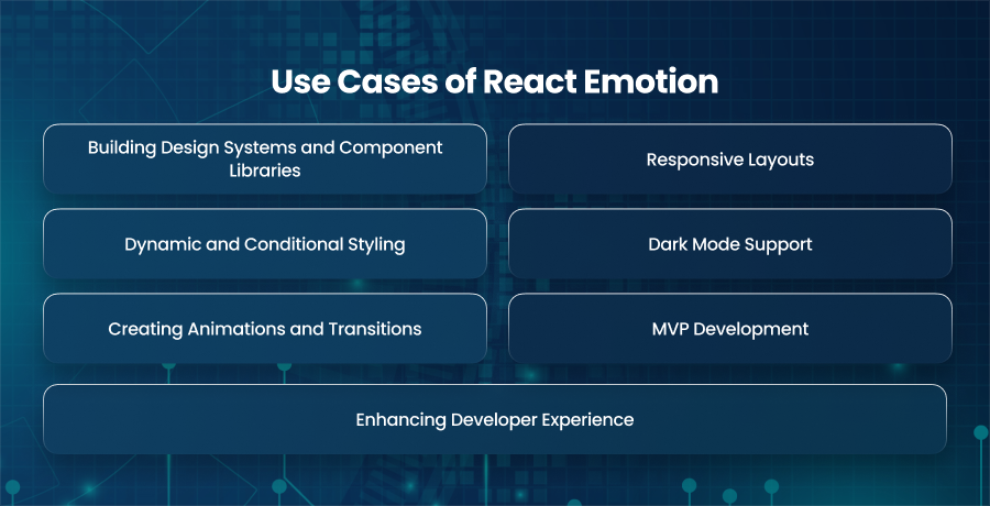
Building Design Systems and Component Libraries
One of the most powerful use cases for Emotion is in the development of design systems and reusable component libraries. Emotion allows you to design extremely reusable, self-contained, stylized components. Additionally, this facilitates design maintenance and scalability over time and encourages uniformity within a project or organization. The ability to use a central theme also ensures that colors and typography remain uniform across all components.
Responsive Layouts
Emotion facilitates the creation of adaptable designs, which are essential for contemporary apps that need to adapt to a range of screens and devices. Additionally, you can swiftly modify layouts in accordance with breakpoints like screen width by using media queries within styled components. This flexibility allows teams to design mobile first or fully responsive interfaces without relying on external CSS frameworks.
Dynamic and Conditional Styling
Emotion excels at handling dynamic styling based on component props or user interactions. You can easily change the backdrop of a card to suit a user’s preferences. This is also helpful in interactive systems because elements of the user interface are always changing in response to user data. The ability to write logic driven styles directly in your components makes Emotion a powerful tool for highly dynamic UIs.
Dark Mode Support
Theming is another important strength of Emotion. Additionally, you can choose different theme objects, such bright and dark themes, and use state to dynamically transition between them. Applications that must take user preferences into account will find this very helpful. With Emotion’s theme support, you don’t have to rewrite styles or duplicate components. All your styled components automatically adapt to the active theme, making it easy to offer a cohesive user experience across multiple modes.
Creating Animations and Transitions
Keyframe animations and transitions are supported by Emotions, enabling developers to add intricate or subtle motion effects to interfaces. Additionally, you may apply animations to any component by defining them directly in your style blocks. For the majority of typical motion requirements, this built-in animation functionality removes the need for extra libraries.
MVP Development
Emotion offers the speed required to build prototypes or MVPs. MVP developers can use the css prop for one off styles or the styled component approach to reuse patterns without setting up a full fledge styling architecture. This ability to write and adjust styles on the fly makes Emotion ideal for testing UI ideas and iterating during the early stages of product development.
Enhancing Developer Experience
Emotion significantly enhances the overall developer experience. It interacts nicely with browser development tools and runs well with TypeScript. Teams can concentrate more on creating amazing user experiences rather than battling with CSS complexity, thanks to these capabilities, which lower friction.
Final Words
Emotion enables React developers to write clean and dynamic styles using modern CSS in JS techniques. For styled components and animations, it adapts to any project size or complexity. Also, by following all the best practices, developers can build consistent and maintainable UIs with speed using Emotion.


