
According to Citrusbug, more than 1.3 million websites are built using React. This is because React introduced a component based architecture, which has completely changed how programmers build user experiences. Instead of writing repeating code, developers may break up projects into manageable, separate components.
Among these, reusable components stand out as one of the most powerful concepts in React development. A well designed reusable component can be used across multiple parts of an application.
Reusability is no longer a luxury in frontend development nowadays. We will thus go over what reusable components are and why they are important in this guide.
What Are Reusable Components in React?
React reusable components are self contained UI elements that may be used in a variety of situations without requiring modification. They may be applied in a range of circumstances due to their adaptability.
Consider reusable parts as construction pieces. They may be used in many ways to make intricate structures without having to start from scratch.
Characteristics of Reusable Components
- Configurable: Accepts props to change behavior
- Independent: Doesn’t depend heavily on specific application logic
- Encapsulated: Manages its own styling
- Composable: Can be combined with other components
A button component, for instance, shouldn’t be connected to a particular page. Rather, it needs to take props like labels or variations so that it may be used elsewhere.
Teams may minimize redundant code and maintain uniformity throughout the user interface by using reusable components. It facilitates the scaling of applications.
Benefits of Building Reusable React Components
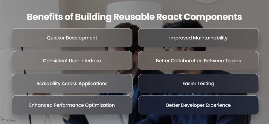
Quicker Development
One of the key advantages of reusable components is the reduction of repetitive code. Developers can create a component once. They can then use it everywhere instead of having to recreate the same components across several pages.
Development cycles are greatly accelerated by this method. Teams might focus on creating new features rather than copying existing patterns. It also reduces the potential for mistakes that might arise from copying code.
Improved Maintainability
Reusable parts act as a single source of truth for elements. When a modification is required, such as when updating a button, you just need to update the component once.
This centralized approach makes maintenance easier. Developers may avoid the hassle of looking through several files by making changes to a single component and quickly updating the complete software. Over time, this significantly reduces technical debt.
Consistent User Interface
For the user experience, consistency is essential. The uniform behavior of elements across the program is guaranteed via reusable components.
Users encounter a predictable interface, for instance, if all buttons and modals are derived from the same component library. This consistency fosters confidence and enhances usefulness.
Better Collaboration Between Teams
Designers and development teams may work together much more easily when reusable components are used. Patterns can be defined by designers and implemented by developers as universal, reusable components.
Many developers may work simultaneously without creating contradictory patterns in large teams, thanks to shared component libraries. Onboarding is accelerated since existing components are simple for new team members to understand and use.
Scalability Across Applications
Reusable parts can be used in more than one application. They may be repurposed for other purposes and bundled as common libraries. This is particularly helpful for businesses that are producing several goods with comparable specifications.
For instance, a business can develop a design system for navigation bars that uses reusable elements for dashboards and web apps.
Easier Testing
Testing reusable parts is simpler. Developers may write unit tests for each component to ensure that it operates correctly when used independently.
It is easier to identify the root cause of problems since each component has a specific purpose. This increases application dependability and cuts down on debugging time.
Enhanced Performance Optimization
React.memo and useMemo are two strategies that may be used to optimize reusable components. Optimizing shared components can have a big influence on overall performance because they are utilized across the app.
Both load speeds and user experience may be improved with a well-optimized reusable library. This is especially true in data intensive applications.
Better Developer Experience
Reusable components improve developer experience by reducing cognitive load. Instead of remembering how to implement common patterns, developers can rely on pre built components.
Faster coding and a more pleasurable development process result from this. Additionally, it frees engineers from tedious tasks to concentrate on business logic.
Common Patterns for Reusable React Components
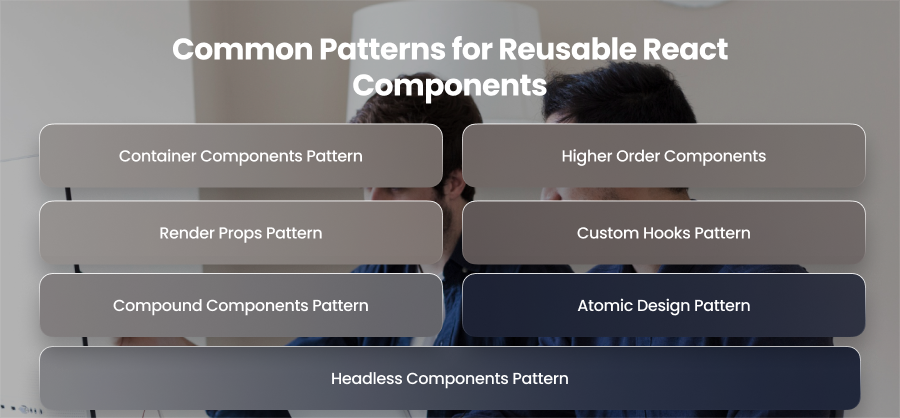
Container Components Pattern
The presentational and container components pattern focuses on separating UI from business logic. Presentational components are responsible only for rendering UI. They receive data and callbacks through props, don’t manage state or perform side effects like API calls. Container components handle data fetching and state management.
Presentational components are very reusable due to this separation, as they are not reliant on a specific data source.
Higher Order Components
Functions that take a component as input and return a new component with more functionality are known as higher order components. They are often used to share cross-cutting problems, including error handling, among many components.
Developers may avoid repeating the same code in several locations by using HOCs to wrap components. While shared activities are abstracted into reusable wrappers, this style maintains core components simple and UI-focused.
Render Props Pattern
A function that decides what should be rendered may be sent to a component as a prop using the render props pattern. The component offers logic and assigns rendering to the user rather than hardcoding the user interface.
This design is very useful for sharing complex processing, such as data collecting, and offers developers total control over how the user interface is shown.
Custom Hooks Pattern
Custom hooks are one of the best methods for reusable logic in React. Stateful logic is transformed by the developers into reusable functions that may be used by other components.
A custom hook, for instance, can manage form validation or API queries. While shared functionality resides in a reusable function, components that use these hooks stay concentrated on UI rendering.
Compound Components Pattern
Compound components are a group of related components that work together while sharing an internal state. A parent component manages state, and child components consume that state implicitly.
The pattern is commonly used for complex UI elements such as tabs and dropdowns. It provides a flexible API for developers while maintaining consistent behavior.
Atomic Design Pattern
Reusable components may be arranged in an organized hierarchy using the Atomic Design technique. Based on complexity, components are divided into atoms, molecules, organisms, templates, and pages.
This patterns help teams manage large component libraries and maintain consistency across applications. It also aligns designers and developers by creating a shared language for UI elements.
Headless Components Pattern
Headless components provide logic and behavior without enforcing any user interface. They let developers create their own styles while exposing state and functionality.
This pattern is often used in UI frameworks and design systems when flexibility is essential. It gives teams complete freedom over design while reusing logic.
Best Practices for Creating Reusable React Components

Keep Components Small
For the creation of reusable components, the Single Responsibility Principle—which holds that each component should have a single, unique purpose—is essential. Small, specialized components are easier to understand and recycle. For instance, instead of building a single, massive component that handles everything, break up the Form component into smaller components like SubmitButton. Developers may match components as needed because to its modularity, which also lessens the possibility of making mistakes and making adjustments.
Design Components to Be Configurable
Reusable components should be highly configurable. Avoid hardcoding values like layout dimensions. Instead, you should rely on props or configuration objects to make components flexible. A button component, for instance, can take label and size parameters. In this manner, the same element can be used for several functions in several application sections.
Favor Composition Over Inheritance
In React, composition is preferred over inheritance. Rather than creating complex hierarchies, compose components by nesting them or passing them as children. For example, a Card component can accept other components like CardHeader as children. With this method, developers may design intricate user interface structures without changing the underlying component functionality.
Use Consistent Naming Conventions
You might be surprised to learn how important naming standards are. Components with descriptive names are simpler to utilize and comprehend. For instance, Button1 is not as detailed as PrimaryButton. Developers are less likely to become confused when names are consistent, particularly in big teams or while developing shared component libraries. Additionally, it facilitates the reading and upkeep of documentation.
Utilize TypeScript
Type safety is critical for reusable components. TypeScript improves the developer experience by guaranteeing that components are used correctly and removing runtime errors. For example, type checking keeps developers from unintentionally providing numbers when a TextInput component expects a text for its value argument.
Maintain a Scalable Folder Structure
A well organized folder structure becomes essential as the number of components increases. It might be beneficial to adhere to patterns like feature structures or atomic design. For simple elements like buttons, you may arrange components as atoms; for combinations of atoms like forms, you can arrange them as molecules; and for bigger structures like navbars, you can arrange them as creatures. A methodical methodology guarantees that developers can find components fast.
Document Components
Reusability requires documentation. Teams may graphically document components using tools like Storybook, demonstrating their appearance and behavior with various objects. Having simple files that describe the functionality is quite helpful. Proper documentation expedites the onboarding process for new developers and guarantees that components are used consistently across the whole program.
Examples of Reusable React Components
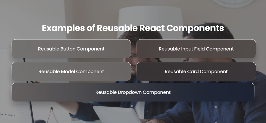
Reusable Button Component
One of the most often utilized components in any program is the button. Using props, a reusable button component may accommodate many styles and behaviors. Developers can utilize a single button component and modify it through settings rather than developing distinct button implementations for primary and secondary actions.
Reusable Input Field Component
Input fields are a crucial part of user interaction in web applications. A reusable input component may handle labels and other input formats, such as text.
Therefore, developers may avoid repeating form field functionality and appearance across different forms by utilizing a reusable input component. This lowers validation errors and guarantees consistent form behavior.
Reusable Model Component
Modals are widely used for alerts and pop ups. Reusable modal components are ideal for a variety of use cases since they can be made to accommodate dynamic content. The same modal might be used, for instance, for onboarding messages or login forms.
Reusable modals ensure consistent overlay behavior and accessibility features such as focus trapping and keyboard navigation.
Reusable Card Component
Grouped information, such as product descriptions or analytics metrics, is frequently shown on cards. Any kind of content can be wrapped in a reusable card component, which serves as a general container.
Developers can maintain consistent layout and styling across dashaboards and pages. Cards are especially useful in SaaS dashboards and content driven applications.
Reusable Dropdown Component
Dropdowns are essential for filters and navigation menus. A reusable dropdown component can accept a list of options and handle selection logic. This makes it adaptable for multiple scenarios such as category filters or sorting options.
Reusable dropdowns ensure consistent interaction patterns and reduce the complexity of managing multiple custom dropdown implementations across applications.
Final Words
Building scalable and high performing apps requires reusable React components. Developers may minimize redundancy and speed up development by adhering to proven patterns and best practices. Investing in reusable components early helps team future proof their codebase and deliver use experiences at scale.


