
React Bootstrap is a famous and valuable front-end framework that combines the features of both React and Bootstrap. Thus, helps in the development of responsive and stylish web applications. With the help of React Bootstrap, the creation of complicated UI elements is possible in a short time along with consistent design.
Why Use Modals, Tooltips, and Popovers?
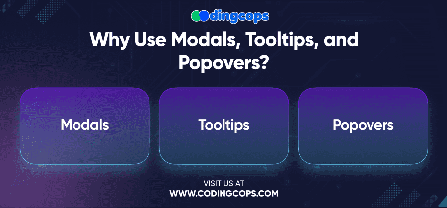
Modals, Tooltips, and Popovers are important components of today’s web design as they allow providing additional information or possible actions that can be done without cluttering the main view. Here’s a brief overview of each:
- Modals
Modals display content in a layer above the current page. Developers can specifically use them for forms, notifications, and dialogs.
- Tooltips
Tooltips are small boxes that give some extra information when users pass the cursor over an item.
- Popovers
Popovers are similar to tooltips but can be more complex and contain more content such as HTML, which appears when the user interacts with an element.
These components make your application easy to use and friendly for the users and thus add to the user experience. They guide your users throughout the interface and offer them additional options according to their requirements. This helps your users to interact with the app in a better way.
- Modals
Modals are very handy in the sense that they can be used to show the form as well as to show the alert. They are intended to make users perform some specific actions, or input further data, without them having to move to another web page.
When to Use Modals
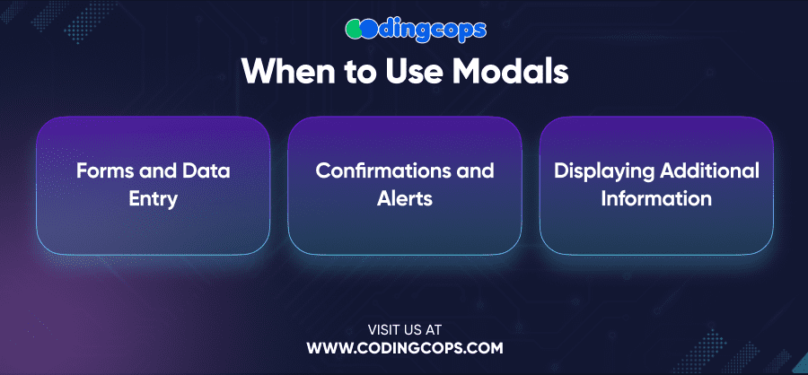
- Forms and Data Entry
Modals are ideal for displaying forms where users can enter information without leaving the current page.
- Confirmations and Alerts
Use modals to ask for user confirmation before performing critical actions, such as deleting data or submitting a form.
- Displaying Additional Information
Modals can also be used to provide users with more information about a particular feature or function.
Best Practices for Using Modals
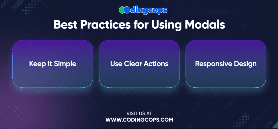
- Keep It Simple
Modals should be straightforward and focused on a single task. Avoid overloading them with too much information or too many options.
- Use Clear Actions
Make sure the modal contains clear and understandable labels of the actions to be performed. These tabs should be more apparent than the functional ones such as the “Save”, “Cancel” or “Close” tabs.
- Responsive Design
Make sure your modals function well across various screen resolutions because sometimes they do not. Modals should move to screen size and should not be a problem on either PC or responsive design-based smartphones.
- Tooltips
Tooltips are the boxes resembling windows that are opened each time the pointer is placed on the object. They are useful when a user requires some additional information regarding anything related to the application but would be quite irrelevant if incorporated as part of the application’s design.
When to Use Tooltips
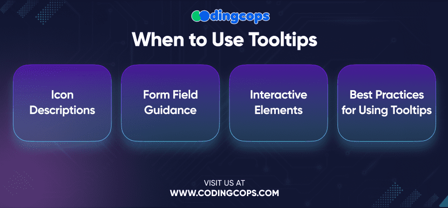
- Icon Descriptions
Incorporate tooltips in instances where an icon or button requires clarification, the icon alone might be confusing to a user.
- Form Field Guidance
Tooltips can be used to provide additional instructions or tips for filling out form fields.
- Interactive Elements
It will also be useful if tooltips contain information about what will happen after clicking on the link or other similar objects.
Best Practices for Using Tooltips
- Keep It Brief
Tooltips must be clear and brief. They are intended to give brief information and not detailed information about the issue being described.
- Placement Matters
Make sure that tooltips appear but do not cover the element a user is working with. The location of the tooltip should be unobtrusive so as not to interfere with the process of interaction between the user and the artifacts.
- Consistent Usage
Use tooltips consistently throughout your application to provide users with a predictable experience. When applying tooltips in certain areas, use the same approach in the other areas of the application.
- Popovers
Popovers are in fact similar to tooltips but they can contain even more text and other HTML tags like images, buttons, or links. It is even more important when you need to give additional information or choice while not leaving the current section of the application.
When to Use Popovers
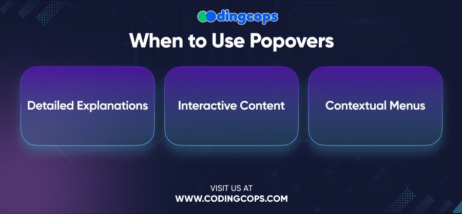
- Detailed Explanations
Use popovers when you need to provide a more detailed explanation or additional options related to a specific feature or function.
- Interactive Content
Popovers can be effectively used to provide means of performing some operation with the content of the page like a form or buttons, without further page navigation.
- Contextual Menus
Popovers can also be used to offer options to the users or to give more information or relevant buttons that correspond to the current section of the website.
Best Practices for Using Popovers
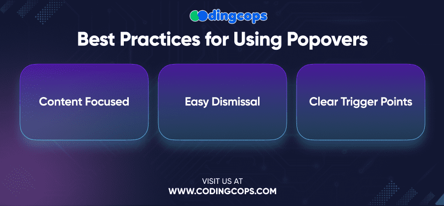
- Content Focused
Ensure that the content within the popover is relevant and focused on the task at hand. Avoid including unnecessary information or options that could confuse the user.
- Easy Dismissal
Popovers should be easy to dismiss, either by clicking outside the popover or by providing a clear “Close” button within the popover itself.
- Clear Trigger Points
Make sure the trigger for the popover is clear to the user. Regardless of whether the popover appears upon a click, hover, or focus, the user must understand what triggers the popover.
Combining Modals, Tooltips, and Popovers for a Seamless User Experience
Another benefit of using React Bootstrap is that Modals, Tooltips, and Popovers can be developed in such a way as to be free from interference with each other.
If all these components are used, they will guide the users through the application and provide the info at the right time.
Use Case Example: A Registration Form
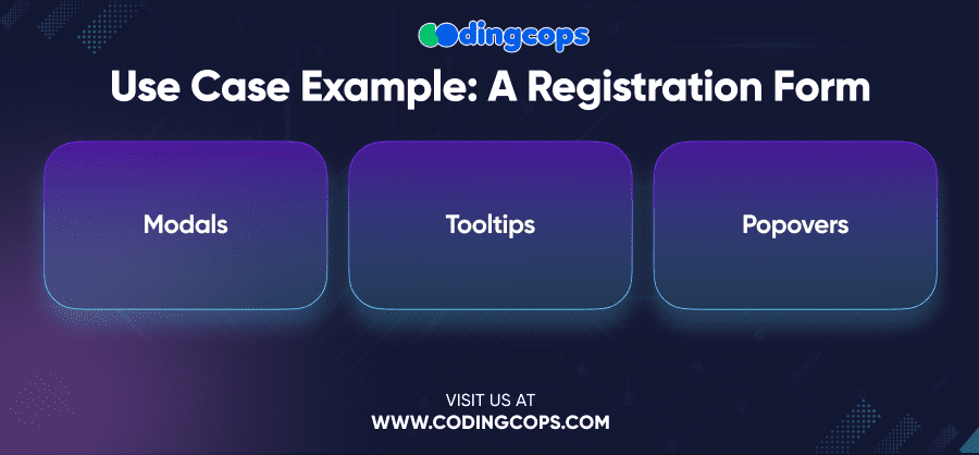
Think of the registration form where you want the field to have the right input without making the user jump to another page or page that has too much information at once.
- Modals
Open a new modal to present the registration form to the users, thus maintaining their attention on the current goal.
- Tooltips
Provide tooltips for each form field to offer additional guidance on what is required or to clarify any potential confusion.
- Popovers
If a user needs more detailed information about a particular field, use a popover to display this content. For example, if a user is unsure about password requirements, a popover can provide a detailed explanation without taking them away from the form.
All these components are integrated in order to offer an effective user-friendly approach that helps the user to complete the registration successfully.
Conclusion
Modals, Tooltips, and Popovers in the React Bootstrap framework are something that can greatly improve the user experience of your web applications. With these components in mind, you can then allow the users to get the information and choices you want to offer them without too much interference from too many other things that they might find distracting.


