
According to Builtwith, 53 million websites across the world use React. This is a result of the growing complexity of modern apps, particularly those constructed using frameworks like React. Maintaining scalability and integrity in UI design is a problem for developers as organizations demand more features and responsive designs.
React’s component based approach already promotes modularity, and projects can easily grow into tangled collections of components that are hard to maintain and scale. In this case, Atomic Design can be helpful. Furthermore, Atomic Design provides a systematic technique for creating and organizing user interface components.
This article will explain what Atomic Design is, how to use it in your projects, and recommended practices.
What is Atomic Design?
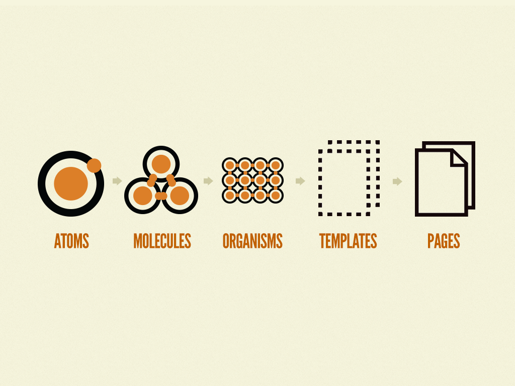
The goal of the Atomic Design technique is to make the process of creating user interfaces more organized and transparent. Atomic Design views UI as a hierarchical system of building blocks, similar to how living things are constructed from smaller pieces in nature, rather than as a collection of displays.
This methodology breaks down UI components into five distinct levels:
- Atoms
- Molecules
- Organisms
- Templates
- Pages
Each level has its own purpose, and together they create a logical progression from the smallest building blocks to complete, content rich pages.
Atoms
Atoms are the fundamental elements of an interface. They are the smallest, indivisible building blocks, similar to HTML tags like buttons or labels. An atom is often a single, reusable component with little logic in React.
- Examples: Button, Input field, Label, Icon, Color palette.
- In React: A Button component that accepts props like label or onClick to keep it flexible.
Atoms set the foundation for consistency. Once defined, they may be used uniformly across the program, ensuring that all inputs behave in the same way.
Molecules
Molecules are groups of atoms combined to form functional units. They are comparatively straightforward parts with a distinct function. For instance, by joining an input atom with a button atom, a search bar may be constructed as a molecule. Similarly, a labeled form field could combine a label atom with an input atom. Molecules strike a balance between simplicity and functionality; they are more meaningful than atoms but not yet as complex as full page sections. Also, in React apps, molecules represent small and reusable components that can appear in multiple places across the app.
Organisms
Organisms are larger, more complex React UI components that bring together groups of molecules and atoms. Moreover, they are significant sections of a page, such as headers or navigation bars. A common example of an organism is a header that includes a logo atom and a search bar molecule. Organisms frequently serve as containers for several reused components in React. This preserves modularity while enabling developers to put together more complex user interface components.
Templates
Templates define the layout structure of a page. Unlike organisms, which focus on creating functional UI components, templates focus on arranging these organisms and atoms into a consistent design framework. For instance, an eCommerce site may have a product detail template where the layout is fixed: header at the top, product information in the middle, and footer at the bottom.
In React, templates are often represented as higher order components or layout components that serve as blueprints. Templates don’t deal with real content but instead outline the structure of how components should be arranged on a page.
Pages
Pages are the final step in Atomic Design hierarchy, where everything comes together with actual content and data. A page is essentially a template populated with real information. A product detail page, for instance, will utilize the product template but include real product information, such as pictures, prices, and descriptions. In a similar vein, a homepage will incorporate dynamic material, such as promotions, using its own template. In React, pages serve as the bridge between the design system and application logic, bringing the entire UI system to life for end users.
Why Use Atomic Design in ReactJS?

Consistency Across the UI
One of the most challenging aspects of frontend development is ensuring that the user interface feels and looks consistent throughout the application. React developers usually create inconsistent headers, slightly varied buttons, or many versions of the same element when they lack organization. This is avoided via Atomic Design, which makes sure that every part is specified once and utilized everywhere. A Button atom, for instance, will always adhere to the same design specifications regardless of its intended application. This uniformity improves the overall user experience and makes the interface look professional.
Reusability of Components
One of React’s advantages is its reusability, but as projects get bigger, developers could inadvertently duplicate components rather of reuse them. Additionally, Atomic Design places a strong emphasis on creating reusable building pieces right away. Atoms and molecules can be shared across multiple templates and pages, saving development time and reducing redundancy. For instance, a SearchBar molecule created once can be reused in a header organism and even in a dedicated search page.
Scalability for Large Applications
As applications change, they often grow in complexity. Without a structured methodology, adding new features or modifying existing ones can lead to hard to maintain codebases. Also, Atomic Design introduces scalability by breaking down the UI into a hierarchy. Moreover, developers can add new pages or templates by assembling existing organisms and molecules, instead of building everything from scratch.
For example, when creating a new product listing page on an eCommerce site, the only step needed may be to reuse the ProductCard creature within a grid layout template. The project’s flexibility will therefore make it easy to expand without incurring more technological debt.
Improved Collaboration Between Designers and Developers
Atomic Design also fosters better collaboration between design and development teams. Designers think in terms of elements like buttons and navigation bars, while developers think in terms of components. Also, Atomic Design creates a shared language where both teams can align. When a designer specifies that a molecule should be updated, developers immediately know it refers to a mid level reusable component. This shared understanding minimizes the miscommunication and speeds up the design to code handoff process.
Easier Testing
Since components are small and well structured, developers can isolate bugs more quickly and write targeted unit tests. For example, testing an input atom is straightforward, and once it is tested, all molecules and organisms that use that input automatically benefit from the same reliability. When updates are required developers can update atoms, and the changes cascade consistently across all higher level components. This reduces repetitive work and ensures high quality code.
How to Implement Atomic Design in ReactJS?
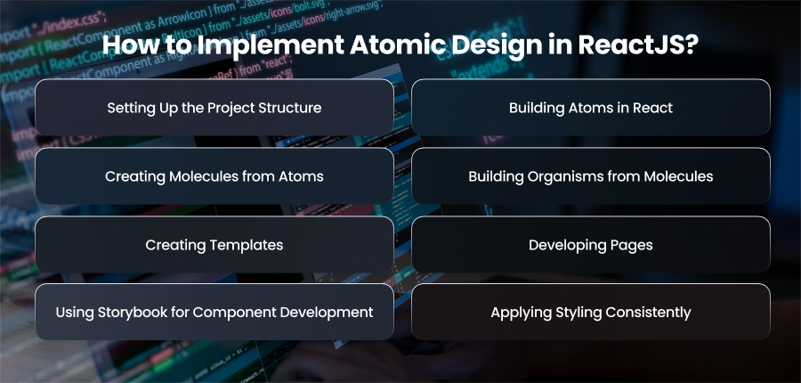
Setting Up the Project Structure
The foundation of implementing Atomic Design in React is to create a well-organized project structure by creating folder separation. This folder separation makes it easy to know where each component belongs, improving consistency and reducing confusion across large projects.
Building Atoms in React
The fundamental components of the design system, such as buttons and headers, are called atoms. Every atom is straightforward, reusable, and independent of other elements. Additionally, because they are independent, they may be joined in many ways to create more intricate structures without compromising functioning.
Creating Molecules from Atoms
Molecules are created by combining multiple atoms to form slightly more complex UI components. They are still small enough to be reusable but serve a more functional purpose than atoms alone. For example, a search bar can be considered a molecule because it brings together an input field atom and a button atom.
Building Organisms from Molecules
Organisms take things a step further by combining molecules and atoms into larger, more meaningful molecules sections of the UI. These are the sections of the interface, such a product card or navigation bar, that begin to seem like whole modules. Because organisms are self-contained, they may be utilized in a variety of application areas without being duplicated.
Creating Templates
Templates represent page layouts. They arrange organisms and atoms in a specific structure that serves as a blueprint for building pages. Templates are not about real data or finalized content, they focus on structure and placement of components. So, by defining templates, developers ensure that different pages across the application follow a uniform design system.
Developing Pages
Pages are where templates come to life with real data and content. These are the actual displays that users interact with; they are made by adding dynamic data and data from APIs to templates. Keeping templates and pages distinct ensures that the basic framework remains consistent, even though the content may vary depending on the purpose of the site.
Using Storybook for Component Development
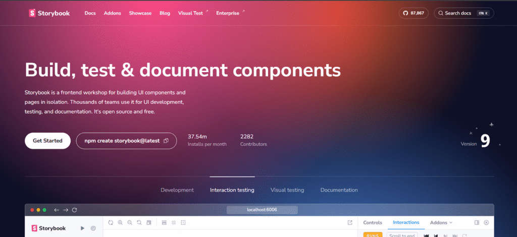
React with Storybook is one efficient approach to use Atomic Design. Before incorporating UI elements into the program, Storybook enables developers to create and test them separately. Because each component can be created and documented separately, this is therefore in perfect harmony with the Atomic Design technique. By offering a visual library of every component, it also promotes cooperation between developers and designers.
Applying Styling Consistently
Styling plays a critical role in Atomic Design because components should look consistent across different parts of the application. Popular approaches include CSS Modules or utility first frameworks like Tailwind CSS. By following consistent styling practices, atoms and molecules maintain their integrity when combined into larger structures, ensuring design uniformity and scalability.
Best Practices for Using Atomic Design in React

Maintain a Clear Folder Structure
A well organized structure is the backbone of Atomic Design in React. It is the responsibility of developers to make sure that every component is categorized correctly. This not only facilitates component discovery but also strengthens the application of the design system’s discipline. By allowing people to intuitively grasp where everything belongs, a clean folder organization also facilitates new team members onboarding process.
Keep Components Independent
One of the biggest advantages of Atomic Design is reusability, but this can be achieved only if components are built with independence in mind. For instance, atoms shouldn’t include extraneous logic that links them to certain sites or features. In a similar vein, organisms and compounds have to be created so that they might be utilized again in other settings without requiring significant alterations.
Use Consistent Naming Conventions
Naming guidelines are essential for maintaining project clarity and avoiding misconceptions. Each part must be given a name that appropriately reflects its purpose. For example, one atom may be labeled Button, whereas a molecule might be called SearchBar. Maintaining naming consistency makes components more easily recognizable and better fits Atomic Design’s tiered structure.
Document Components Thoroughly
Documentation plays a key role in ensuring that components are used consistently. Good documentation should include usage guidelines and styling details. This practice helps both developers and designers collaborate effectively while preventing misuse or duplication of components.
Prioritize Design Consistency
Atomic Design aims to link development with design principles and is not only about coding. To make sure that atoms and molecules adhere to uniform design standards, such typography and accessibility guidelines, developers should collaborate closely with designers. Accordingly, components maintain their visual coherence and scalability throughout the program by using consistent design tokens or style standards.
Test Components in Isolation
Testing is essential to building reliable applications, and Atomic Design makes it easier by promoting isolated components. Each atom and organism should be tested independently before being integrated into templates or pages. Visual regression testing and unit testing guarantee that components function as intended even when repurposed in various settings.
Final Words
React’s Atomic Design gives developers the ability to create reusable and modular user interfaces. Teams can get consistency and flexibility by following best practices and segmenting interfaces into organized layers. This methodology bridges design and development, creating applications that grow seamlessly with business needs.


