
According to Citrus Bug, there are over 3,685,454 websites in the USA that use React for building their frontend. Moreover, these React apps require data visualization to showcase on their user interface, and for that, they hire dedicated React developers. Whether users want a dashboard or reports, intuitively presenting data can enhance their experience.
The React ecosystem is rich with chart libraries that can help make complex visualizations simple and elegant. So, in this guide, we will explore the best React chart libraries and also provide actionable tips for integrating them into your project.
What is a React Chart Library?
A React chart library is a specialized toolkit that provides pre built components for creating data visualizations directly within React applications. Moreover, these libraries work seamlessly with React’s declarative and component architecture. So, this makes it easier for developers to integrate charts into their UIs without building them from scratch.
Furthermore, React chart libraries take raw data like numbers and categories and convert them into visual representations like bar charts and line graphs. Moreover, these libraries also provide pie charts and heatmaps. This process involves complex calculations for layout and scaling. Next, the library renders the data. Additionally, this allows developers to focus on data and presentation.
Features of React Chart Libraries
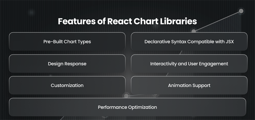
Pre-Built Chart Types
React chart libraries have a wide range of pre built chart types. So, whether you need a basic bar chart or more advanced options like radar charts, these libraries have you covered. Moreover, this saves developers from the hassle of manually constructing visual elements.
Declarative Syntax Compatible with JSX
React chart libraries are designed to align with React’s declarative programming model. Instead of imperatively writing code that tells the browser how to draw a chart, you simply describe what the chart should look like using JSX. Hence, this approach makes the chart code easier to read and debug, especially when charts are built dynamically based on application state or props.
Design Response
Users expect web applications to work flawlessly across a variety of devices and screen sizes. Moreover, React chart libraries support this demand by offering responsive design features. Moreover, charts can automatically adjust to fit their containers and respond to window resizing. Furthermore, this ensures your visualizations look sharp and remain user friendly on all devices.
Interactivity and User Engagement
Interactivity makes charts more engaging and informative. Additionally, React chart libraries frequently include features like legends for changing the visibility of data series and tooltips that show up when users hover over data points. Additionally, these interactive features facilitate users’ exploration and comprehension of the material.
Customization
Every application has unique design requirements. And chart libraries offer extensive customization options to ensure your charts align with your brand and UI. Moreover, you can tweak everything from colors to data point styles. Also, many libraries support theming. This allows you to apply consistent styles across all charts or easily switch between light and dark modes.
Animation Support
Enhancing user interfaces through visual feedback is crucial, and animations greatly enhance this effect. Smooth animations are supported by the majority of React chart libraries and may be initiated either by user interactions or at initial rendering. Additionally, these animations not only enhance visual appeal but also aid users in comprehending data transitions, including variations over time or category comparisons.
Performance Optimization
As applications scale and the volume of data increases, performance becomes a concern. Moreover, React chart libraries address this by implementing various optimization techniques. These include visualization to render only visible elements. Moreover, they can offload graphics processing to the GPU through WebGL rendering. So, with these optimizations in place, charts remain fast and responsive, even when handling real time updates or large datasets.
Best React Chart Libraries
Recharts
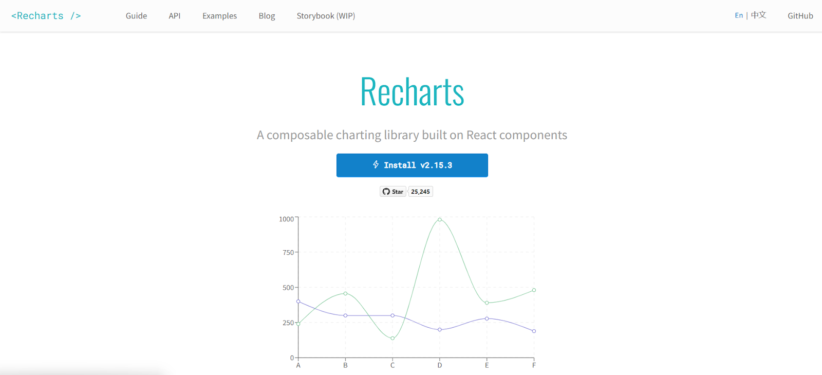
Recharts is one of the most popular React chart libraries. This is favoured by developers because of its integration with React’s component architecture. Built on top of D3, it abstracts away a lot of the complexity while offering a robust and flexible API. Recharts also supports a variety of chart types, including line and bar charts. It is therefore appropriate for the majority of usage scenarios. Furthermore, its declarative syntax aligns well, and developers appreciate how easy it is to implement responsive and interactive charts with minimal setup.
Victory
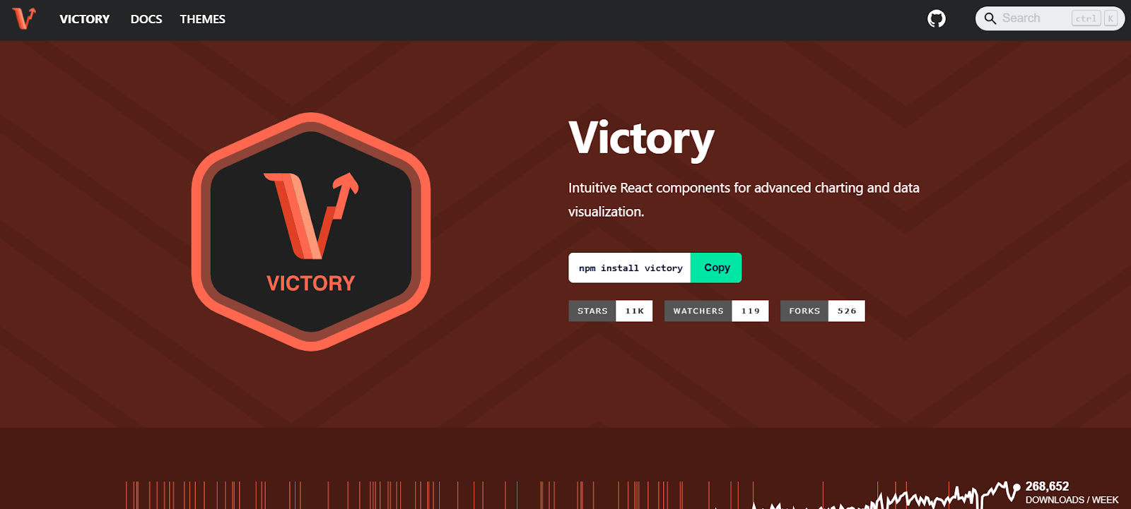
Victory is another reliable charting library designed specifically for React. Additionally, it stresses composability and modularity. This enables developers to use reusable components to create intricate data representations. Furthermore, Victory offers a wide range of chart types along with strong support for animations and transitions. Its accessibility is its most notable attribute. This guarantees that all users, including those who use screen readers, may utilize the charts. Moreover, Victory is a solid choice for developers building enterprise applications that require clean and accessible charts.
Visx
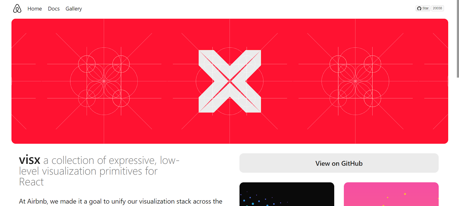
Visx takes a unique approach by blending the power of D3 with the flexibility of React. Moreover, Visx offers a low-level toolbox for creating unique visualizations rather than operating as a conventional charting library with pre built chart types. For teams who desire complete control over the layout and design of their charts, this makes it perfect. Compared to other libraries, it has a steep learning curve, but the work is worth it because of its unparalleled performance and versatility.
React Vis
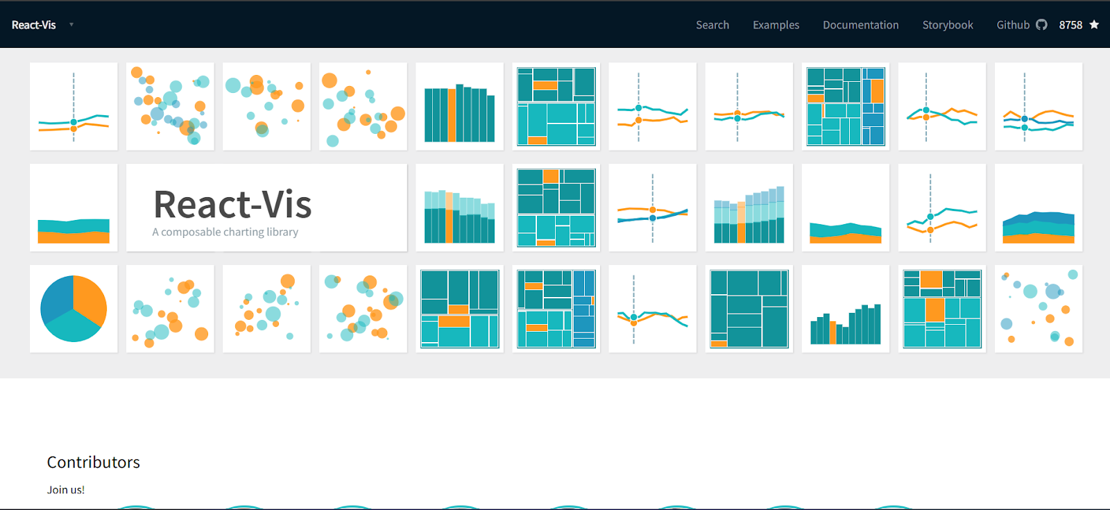
React Vis offers a straightforward way to build charts using reusable components. It also enables a variety of visualizations. The library’s capacity to produce intricate charts with little setup is one of its advantages. Also, React Vis includes support for animations and other interactive elements.
BizCharts
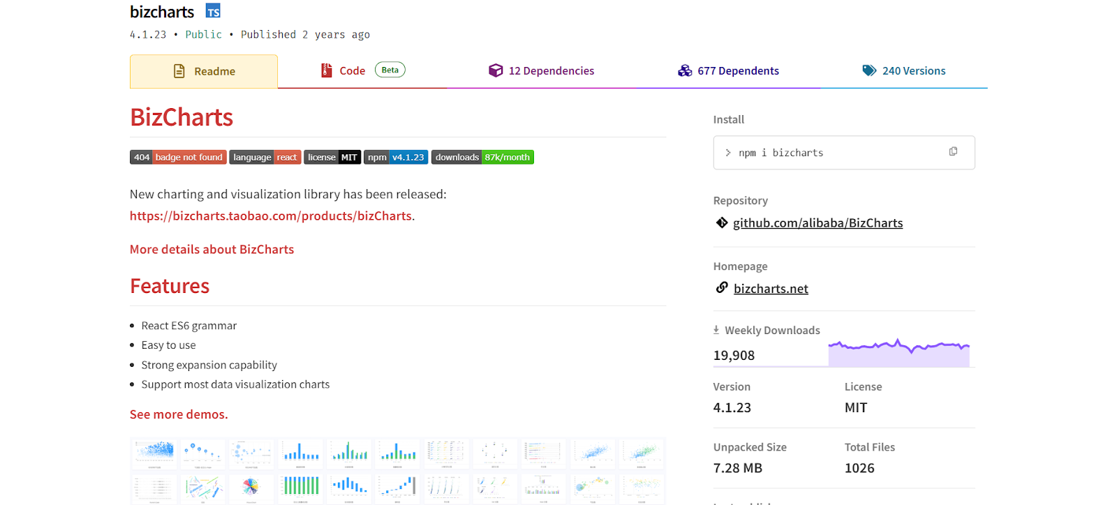
Another great React chart package with a wide variety of chart kinds and customization possibilities is BizCharts. This makes it a good option for both interactive analytics tools and basic dashboards. BizCharts stands out with its advanced layout and styling capabilities and data filtering.
Rumble Charts
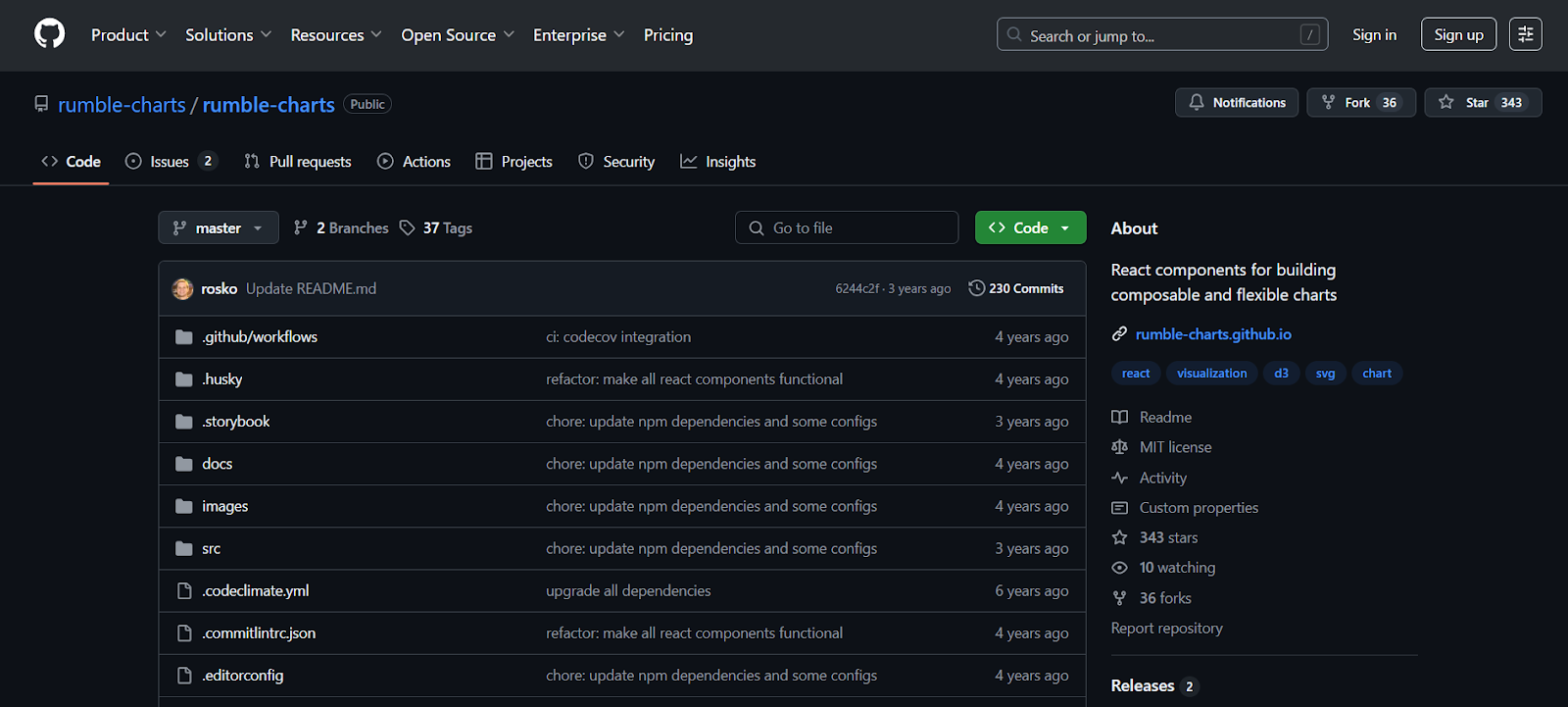
Rumble Charts is a lesser-known but capable React chart library based on D3. It also emphasizes usability and simplicity. Additionally, it provides a collection of modular chart elements that are easy to include in any React application. It is appropriate for developers who need to generate simple charts with little setup, while having less functionality than some of the other tools.
Ant Design Charts
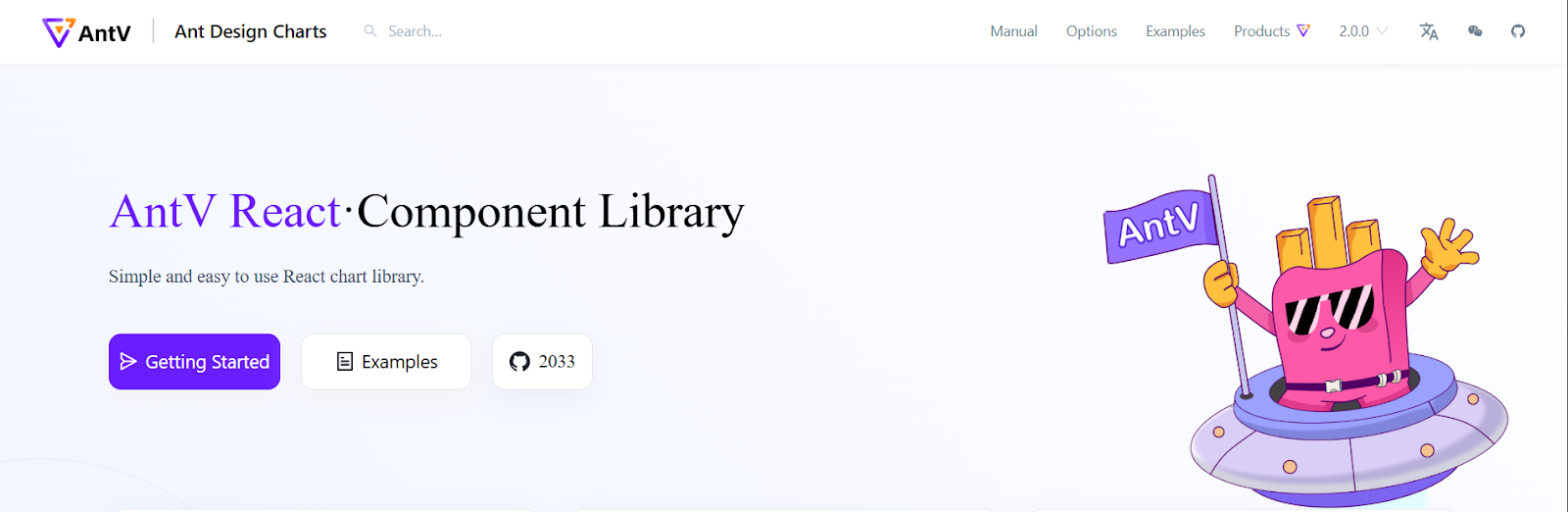
The Ant Design ecosystem includes Ant Design Charts. It offers a wide variety of interactive features, chart kinds, and fluid animations. It includes drill-down and brush data exploration functions, which are very helpful for an analytics dashboard. With strong documentation and active community support, Ant Design Charts offers a enterprise ready solution for data visualization.
eCharts for React
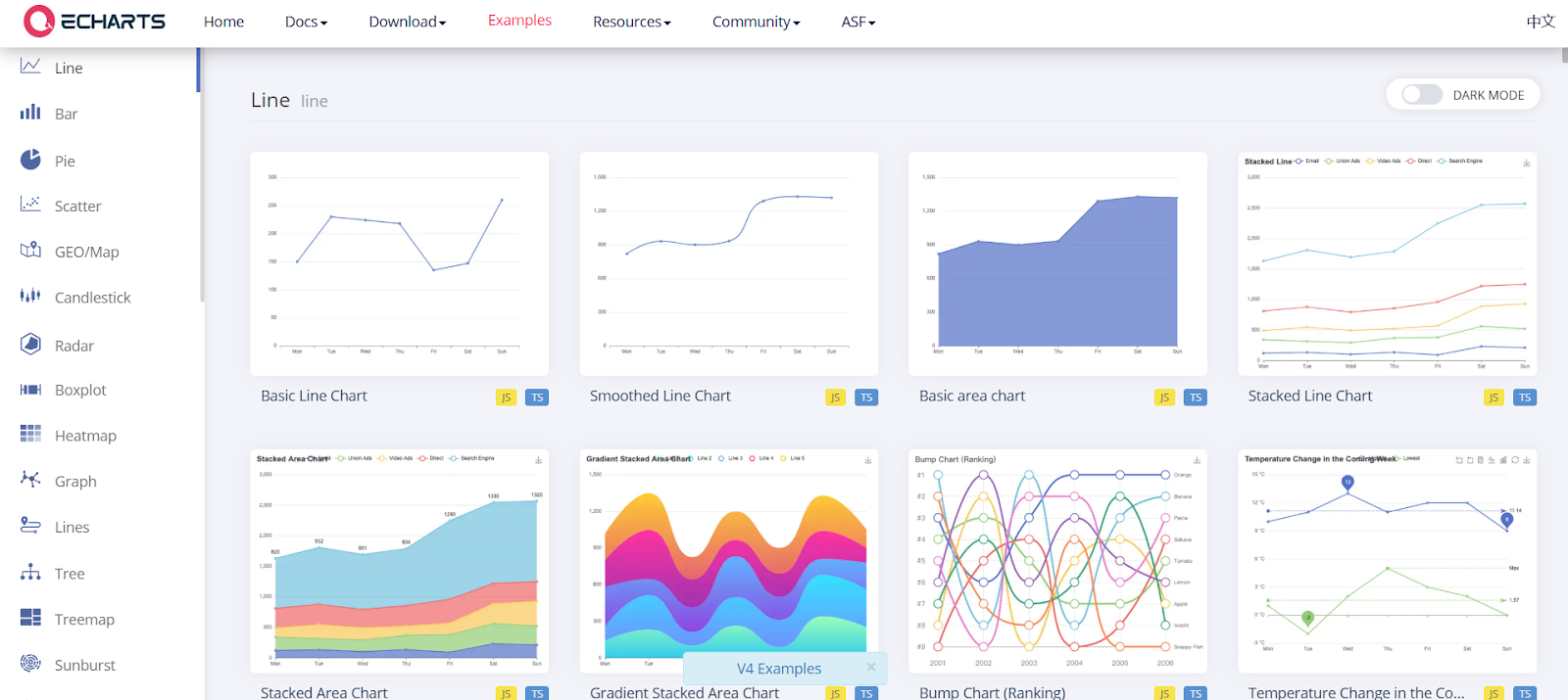
The Apache Software Foundation created Apache eCharts, a robust visualization and charting tool that is wrapped in React as eCharts for React. It supports a wide variety of visualizations and is renowned for its performance and adaptability. Deep customization is possible because of React, which gives complete access to eCharts’ rich configuration options.
React-Time-Series-Charts
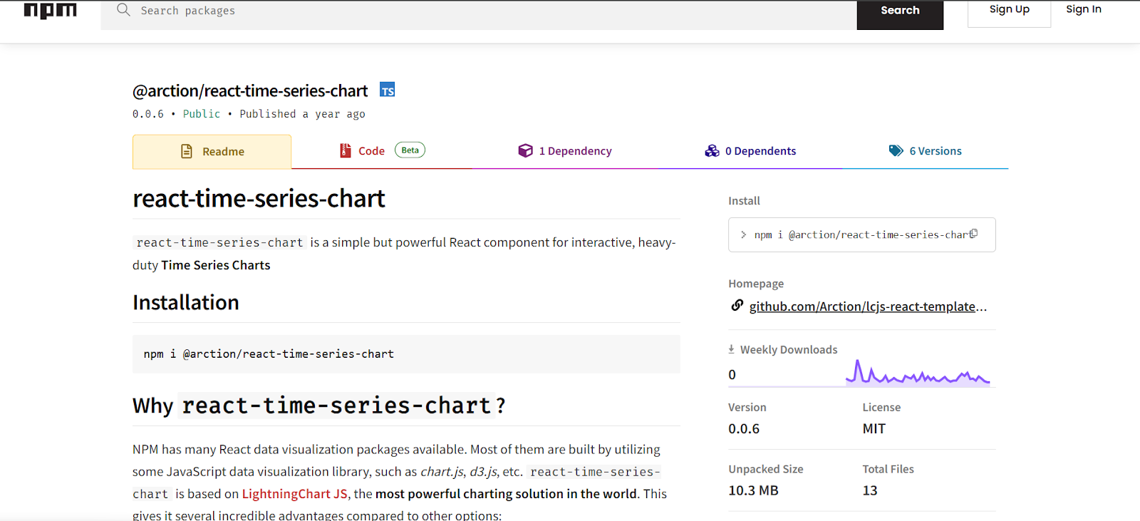
React time series charts is a specialized library focused on rendering time series data. Moreover, it provides components optimized for tracking changes over time. Hence, this makes it particularly useful for financial and IoT applications. The library includes features like dynamic brushing and allows users to interact with data intuitively. While it can not offer the broad charting capabilities of more general purpose libraries, its narrow focus ensures excellent performance and clarity when working with temporal data.
React-Financial-Charts
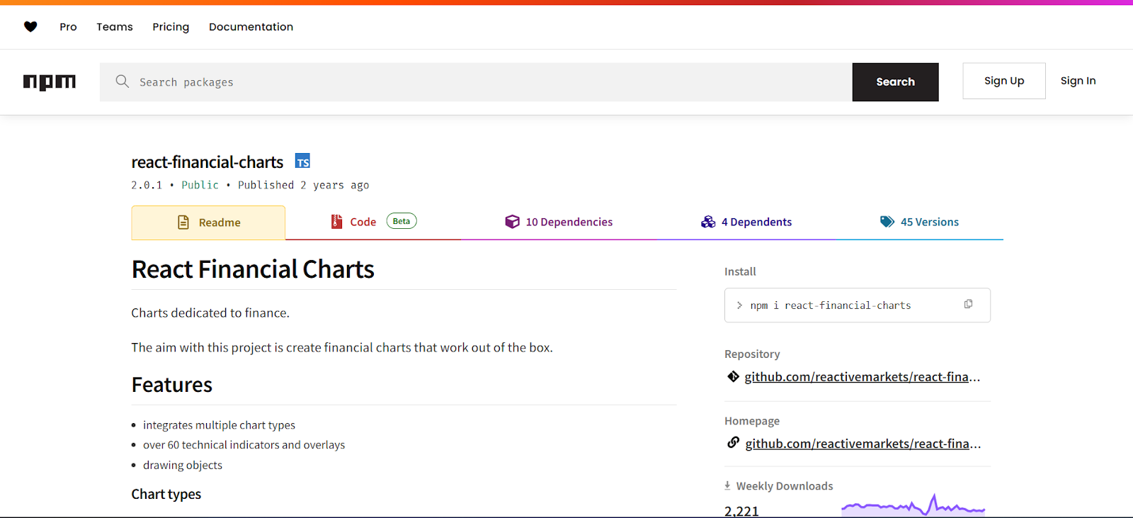
A dependable and extremely specialized library for creating stock market and financial charts is React Financial Charts. This feature rich library supports candlestick charts and Bollinger Bands. Additionally, it allows you to adjust every interactive and visual element of the chart, which is essential in financial applications where precision and focus on detail are essential.
Tips for Using React Charts
Know Your Audience and Data
Before integrating React chart libraries, you should understand who will be viewing it and what insights they need to gain. Are you building dashboards for executives who prefer high-level summaries or for data analysts who need to dig into granular details? Next, you should choose the right chart type depending on your audience’s expectations and the nature of your data.
Start Simple and Then Customize
It’s tempting to jump into complex and multi layered visualizations right away. However, starting simple ensures clarity and performance. You should begin with a basic chart and validate that it displays your data correctly. After that, you can layer on additional elements like tooltips and legends. This iterative approach reduces bugs and makes the development process easier to manage.
Reusability with Chart Components
React’s component architecture is perfect for creating reusable chart components. You should create a reusable chart wrapper that takes data and style props rather than repeating chart setups across your application. This guarantees uniformity throughout your application while also saving time. Moreover, if your project involves similar visualizations across multiple pages, reusability will significantly streamline your codebase and improve maintainability.
Make It Responsive
Most React chart libraries offer built in responsiveness, but still, its important to test across screen sizes. You can use percentage widths or flexible container styles so that your charts adapt seamlessly to their environment. A responsive chart improves the overall user experience and makes your application more accessible.
Optimize for Performance
Charts can become slower or unresponsive when dealing with large datasets or frequent updates. To ensure smooth performance, you can use techniques like data downsampling and virtual rendering. Some libraries also allow you to switch from Canvas rendering, which is more efficient for large scale data. Furthermore, you should always profile and monitor your chart’s performance, particularly if you’re building a dashboard or financial app with real time data feeds.
Use Tooltips
Without overcrowding the chart, tooltips may give users information when they need it. Nonetheless, you should keep tooltips brief and pertinent and refrain from packing them full of information. Moreover, legends are equally important for understanding multi series charts. Furthermore, you should ensure that they are clear and interactive.
Don’t Overload with Data
Although it might be tempting to include as much information as possible on one graphic, doing so can overload consumers. Additionally, you should pick the most essential data elements and concentrate on clarity. If you need to show multiple dimensions, you should split the data into multiple charts or use interactive filters.
Keep Styling Consistent
Your charts should match the visual language of the rest of your application. Additionally, you should use consistent fonts and colors to avoid the charts looking like they were lifted from another app. Most React chart libraries have theming and custom styles that allow you to personalize the look and feel of your project. Make sure your charts align with any design systems or user interface frameworks you are using for a cohesive experience.
Test Charts
Charts are interactive UI elements and should be treated like any other component in your React app. You should write tests to verify that charts render correctly with the given data. Moreover, your tests should verify user interactions and that accessibility features function properly. Moreover, integration tests can help catch regressions as your application changes.
Final Words
Therefore, creating interactive and eye-catching data visualizations is made easier with React chart frameworks. Thus, developers can create responsive and high-performing charts by using the appropriate tool and adhering to best practices. Use these libraries to guarantee clarity and a seamless user experience on all devices, whether for dashboards or analytics.