Imagine you are presenting data to your audience by reading from a report in your hand or via a vague presentation. Will this positively impact your audience? Surely not!
So, how should the data be presented when we are living in a data-dominated world? Let’s find out!
Businesses of all sizes and niches have some numbers, figures, and metrics to present to their clients or audience to better drive growth for their business. However, raw data or meaningless data presented can prove to be a disaster for your business. Instead, you need to present data in the form of visuals.
Data visualization transforms complex information into visual formats such as charts, graphs, maps, dashboards, etc. Data presented in such a form helps decision makers grab the key insights at a glance.
Hence, to make you aware of the importance of data visualization and best practices, we researched and wrote a comprehensive article. This article will help you understand why visuals are important and how they can drive success for your organization.
So, let’s start!
Why Data Visualization is Important
Visualization of data is the vital part of modern business because visualizing the data and, therefore, increasing the comprehension of the data and trends and speeding up the process of decision-making. Visuals are more likely to be responded well by the people when compared to unprocessed data or words. Charts/graphs can be very effective as far as simplification of a complicated data is concerned.
Good visualizations identify patterns, correlation and outliers that would be otherwise not observed in the spreadsheets and thus help businesses to derive new trends. In addition, visual data is easier to distribute across teams and other stakeholders, including non-technical individuals.
Lastly, time is also a crucial factor that plays its role in management and in high-level decision-making. Visuals enable businesses to get the essence of visuals in a short period of time and act decisively.
Data Visualization Formats
There are various visualization formats available that play their role in driving better business decisions. All you need to do is choose the right format for your business.
Here are a few data visualization formats that you can choose from:
- Bar Charts
- Line Graphs
- Pie Charts
- Heat Maps
- Scatter Plots
- Bubble Chart
- Treemap
Best Practices to Use Data Visualization for Businesses
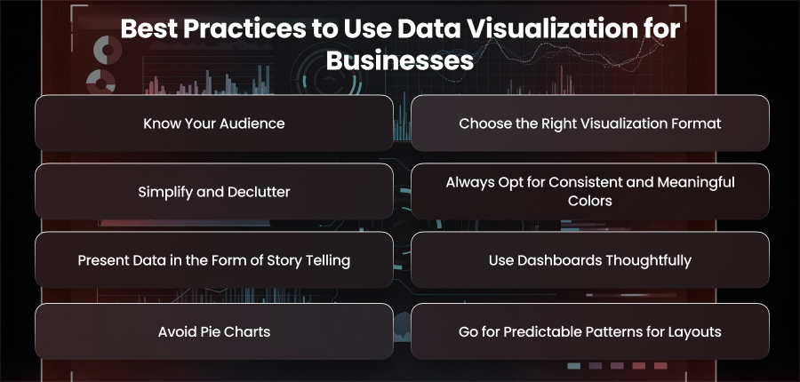
Know Your Audience
First and foremost, you need to know your audience. Knowing that you are creating visualizations for a specific audience matters a lot. You make visualizations for catering to the people who will use them. Here’s a checklist that you need to check before you make any data visualization decision.
- You need to understand the technical proficiency of your audience. If most of your audience is non-technical, it is good to go with simple visualizations. However, if your audience is technically sound, you can enjoy the liberty to go with any complex visuals.
- The level of detail shall also be considered. For this, you can make high-level summaries for leadership and granular breakdowns for analysts.
- Don’t overfill data. Only include the relevant KPIs that your audience actually cares about.
Choose the Right Visualization Format
From a wide list of visualization methods, you should choose the one that suits your needs and audience. Every method tells a different story. So, you have to be very careful in choosing the right visual for displaying your content in the right way.
The key is to choose a chart type that matches your data and the story you want to tell your users.
Chart Types and When To Use Them
The given table shows the common chart types and their best usage. Understand it and utilize it accordingly.
| Chart Type | Best Purpose |
| Bar Chart | Bar charts are commonly used to compare values across various categories. |
| Line Chart | Businesses use a line chart to display trends over time. |
| Pie Chart | A pie chart is used to display part-to-whole relationships. |
| Scatter Plot | It is used for correlation and distribution. |
| Heatmap | Heatmaps are widely used to visualize the magnitude or intensity of something. |
| Bubble Chart | It shows data with three dimensions and is best to visualize profit, cost, and size. |
| Treemap | Treemap is best suited for hierarchical data. |
Simplify and Declutter
Clutter anywhere ruins the beauty and makes the space feel congested. The same is the case with visualization methods. Overcrowding the charts can be your enemy on the way to driving business growth.
Moreover, cluttering the dashboard or visuals with too many elements is responsible for confusing the user.
Here is a list of things you can do to get rid of this issue.
- Eliminate dispensible gridlines, borders, or 3D effects.
- Don’t overuse colors and fonts.
- Put labels on the elements of visuals. Don’t put the user in the guess state.
- Utilize the white spaces on your visuals effectively for better readability and reducing cognitive load.
Always Opt for Consistent and Meaningful Colors
Colors are used to grab the attention of users. Using the right colors in your visuals is of sheer importance as they help highlight, segregate, and alert the audience. However, misusing the color palette can lead to blunders.
Imagine that you highlighted a downfall of one product with green color and the success of another product with red color. What message would you convey to your audience?
So, follow the best practices below while choosing colors.
- Follow your company’s brand color. Use those colors for consistency in business documentation and reports.
- If you are comparing the stats or progress of items, it is always a good practice to stick to one color family.
- You never know the ratio of color blind people in your audience. Hence, to cater to those people, you sparingly need to use red and green colors.
- Opt for bold colors when visualizing key highlights.
Present Data in the Form of Story Telling
Just throwing numbers at the face of the audience can drastically impact your reputation. Whether positive or negative, you must present numbers by shaping them into a narrative that aligns with your business goals.
Crafting a story for data is easier. Follow the steps below to create a story.
- Start your presentation with a question. Like, “Why did our revenue dip in the last month?” Or “why our xyz product succeeded despite flaws?”
- Structure your visuals to reveal the reasons and effects.
- To highlight key findings, use annotations or callouts.
- Take your user along with you from start to finish by creating a storyline.
Use Dashboards Thoughtfully
Dashboards play a significant role in decision-making. A well-structured dashboard is not less than a strategic tool empowering leaders to track progress, performance, identify trends, and make timely decisions. Dashboards can prove to be an invaluable asset for your business, but you have to design them with clarity and usability in mind to drive success for your business.
Let’s go through the best design strategies for dashboards.
- Opt for designing dashboards for group-related data.
- Avoid information overload by limiting visuals to 5-7 widgets per view.
- You should use filters and interactivity to allow users to explore data.
- Never mix up the real-time and historical data to avoid a mess. Keep both visuals separate to avoid confusion.
Avoid Pie Charts
Yes, you read it very right. Avoiding pie charts is sometimes essential. This data visualization method is useful when you have to show a small number of data segments. However, in case of a large number of data segments, the user faces the problem of comparing areas or angles to determine which has a larger portion and which has a smaller.
Hence, in such cases, it is recommended to use Donut charts. Using Donut charts eliminates the need to compare angles.
Go for Predictable Patterns for Layouts
Humans respond to visuals that convey information quickly and are drawn to patterns naturally. Data visualization facilitates understanding of information presented sequentially, whether that be numerical, alphabetical, or sequential.
A fluid succession is ensured by sticking to cultural reading habits, which are typically left-to-right. Observers can connect discoveries without getting lost if multiple graphs have a consistent design. Moreover, important messages are effectively conveyed, and the audience is engaged by a well-organized layout.
Best Data Visualization Tools
We have made a list of some top-notch data visualization tools that one can use to drive success for their business. Here is the list:
- Tableau
- Infogram
- ChartBlocks
- Datawrapper
- Google Charts
- FusionCharts
- Chart.js
- Graffana
- Power BI
- Zoho Analytics
- Qilk
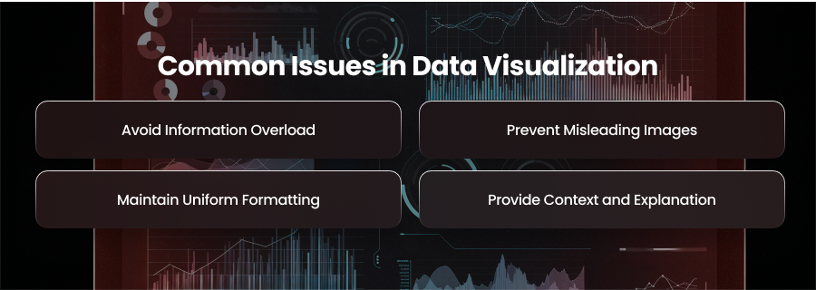
Common Issues in Data Visualization
Regardless of how powerful the tools you use, certain pitfalls always come your way to challenge you. Similar is with data visualization methods and best practices. Here are a few challenges you need to overcome while planning to drive growth for your business using data visualization.
Avoid Information Overload
Never overload information in visualizations. Overloading too much information into a single chart may overwhelm your viewers. Maintain clarity and interest by focusing on core data points and segmenting large sections into smaller images.
Prevent Misleading Images
Using skewed cutting axes or scales can distort trends. To preserve credibility and audience trust, data should always be presented truthfully using proportionate charts, precise labels, and unambiguous depictions.
Maintain Uniform Formatting
Charts that use different colors, fonts, or styles can be confusing. Make your graphics easier to read, navigate, and comprehend at a glance by using a single design system.
Provide Context and Explanation
Even stunning images require context. In the absence of labels or vague explanations, charts may be confusing. Always clarify what viewers are seeing to prevent them from misinterpreting the information.
Summary
Data visualization does not only involve catchy charts. Employed in the right manner, this action can assist businesses with a competitive advantage, prompt action, and reveal insights.
We gave you the best practices for data visualization that will help you drive success for your business. Implement these best practices strategically to get fruitful results. Doing so will result in smooth business operations, improving customer satisfaction, and boosting profitability.