
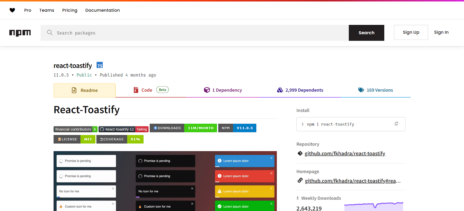
According to Peerlist, React Toastify is an extremely popular library for React with over 20 million weekly downloads. This is because modern web applications focus on user engagement and real time feedback. When consumers save a document or submit a form, they anticipate a prompt and clear answer.
But manually integrating notifications in React can be a pain, particularly if you want them to be dynamic and customized across devices. React Toastify can therefore assist you in implementing toast alerts without being mired in settings.
Therefore, we’ll go over how to utilize React Toastify to add alerts to React apps in this guide.
What is React Toastify?
A flexible and intuitive notification tool is React Toastify. Additionally, it lets developers create toast notifications, tiny, distinct messages that flash on the screen for a brief while to alert users to events and actions. A crucial component of modern user experiences, React Toastify also eliminates the hassle of creating toasts from scratch.
Moreover, React Toastify provides a component solution for triggering notifications in a clean and declarative way. Also, Toastify embraces the React philosophy, unlike traditional libraries that require complex setup or manual DOM manipulation. So, if you simply place a <ToastContainer/> component in your application layout and then call the toast () function wherever you need to display a message.
Additionally, React Toastify has a ton of capabilities, such as automated dismissal and predefined message formats. Additionally, it enables more complex use cases like eliminating duplicate messages and managing asynchronous actions.
So, whether you are working on a single page application or a multi component dashboard, React Toastify offers an intuitive solution that fits naturally into your React workflow.
Features of Toastify
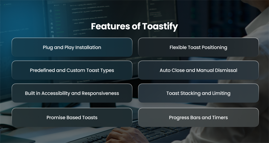
Plug and Play Installation
React Toastify is easy to get started with. Thus, you can start showing toast messages immediately with a single installation command and little setup. Additionally, no boilerplate code or extra setting is needed. For developers who wish to swiftly deploy notifications without investing time in creating specialized components, this makes it a great option.
Flexible Toast Positioning
You have total control over where toasts show up on the screen using React Toastify. Additionally, you can place them in any of the six typical locations. Hence, this flexibility ensures that your notifications don’t obstruct critical parts of your interface. Also, you can have multiple ToastContainer components in different places if needed, which is helpful for large applications.
Predefined and Custom Toast Types
To simplify usage, Toastify comes with built in messages types like success and warning. Also, each type has its own styling and icon, allowing users to quickly understand the purpose of the message. However, beyond these defaults, you can also create custom toast with JSX. This means you are not limited to plain text. You can now build interactive and custom components as needed.
Auto Close and Manual Dismissal
You can set up toast notifications to automatically end after a predetermined amount of time with React Toastify’s autoClose feature. Therefore, if you want the toast to stay on the screen until a user engages with it, you may hire React developer to completely eliminate auto dismiss. You can additionally choose the make the toast dismissible with a swipe gesture or to add or remove the close button.
Built in Accessibility and Responsiveness
Toastify is highly accesibility. Also, Toasts can render using proper ARIA roles like role=”alert” to ensure compatibility with screen readers and assistive technologies. Hence, this makes your application more inclusive for user with disabilities. Also, toasts are fully responsive and look great across different devices and screen sizes.
Toast Stacking and Limiting
In high interaction applications, you might encounter situations where multiple notifications are triggered at once. React Toastify allows you to limit how many notifications can appear on the screen simultaneously by setting the limit prop. Thus, this helps prevent notification overload and keeps the UI clean.
Promise Based Toasts
One standout features of React Toastify is its built in support for promise based toasts. Additionally, you can quickly display various alerts depending on the results of asynchronous tasks, such API requests, by using the toast.promise() function. You can display a loading notification while the request is waiting. Furthermore, it instantly changes the toast to provide a success or error message as the request is complete.
Progress Bars and Timers
Toasts have the ability to show animated progress bars that show how long they will stay on the screen. For more accurate timing, you can manually manipulate these bars or have them operate automatically. Moreover, this visual cue is particularly helpful for users to understand the urgency or temporary nature of the message.
Why Should You Use React Toastify?
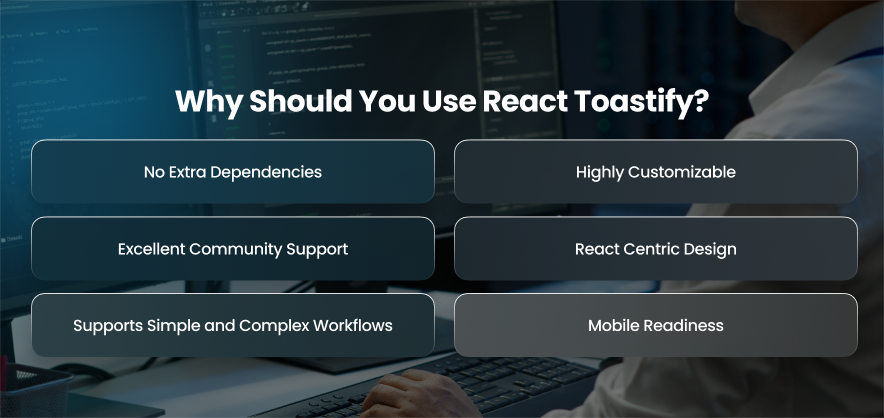
No Extra Dependencies
Toastify’s most noteworthy features is its independence from outside dependencies. It is also a self contained package, which keeps your bundle size small and reduces the number of items that could break in your project. It’s a lightweight solution that won’t make your application bloat as a result.
Highly Customizable
While the default toast styles and icons are polished and effective, React Toastify allows you to to take full control over how your toasts look and behave. Therefore, you can pass custom components and control the timing of each toast. So, whether you want to maintain a minimalistic aesthetic or align with a specific brand theme.
Excellent Community Support
There is ongoing maintenance and usage of React Toastify. You can thus anticipate regular updates and strong community support. If you run into issues, GitHub and other communities also provide solutions. Also, the documentation is also detailed and beginner friendly, hence making it easy to integrate and troubleshoot the library in your application. Also, this vibrant ecosystem of users and contributors helps ensure the tools remains reliable and up to date.
React Centric Design
Toastify fits naturally into your React application’s architecture because it was built specifically for the React ecosystem. Unlike JavaScript libraries that require wrappers or hacks to integrate into React, Toastify uses components and hooks in a way familiar to any React developer. Moreover, you can trigger toasts from within functional or class components and even use them with state.
Supports Simple and Complex Workflows
React Toastify works just as well for quick, one line notifications as it does for more complex workflows. A single toast.success (“Saved!”) call is enough. Moreover, you can use toast.promise() to show loading and success states with one clean block of code.
Mobile Readiness
Good UX means being inclusive, and React Tostify helps you achieve that. By default, its notifications are available, utilizing appropriate ARIA responsibilities and attributes to ensure accurate message interpretation for screen readers. Toasts also appear and function properly on all screen sizes because to their responsive design. Hence, this mobile readiness saves you a lot of trouble of writing additional responsive styles.
How to Install and Set Up Toastify?

Install the React Toastify Package
You can install the React Toastify using a package manager like npm. Also, the installation process is fast and lightweight, adding only what is necessary to your project without bringing unnecessary dependencies. Moreover, it is compatible with both JavaScript and React based applications.
Import the Required Styles
After installation, you will need to import the default CSS styles that come with React Toastify. Moreover, these styles control how the toast notifications appear on the screen. Also, with these styles, the toasts may still function, but they won’t have the intended visual presentation. Hence, importing this CSS file ensures that your toasts are clean and responsive.
Add the Toast Container to Your App
The next step is to add the ToastContainer component to your application. Hence, this component is responsible for rendering the actual toast messages. Additionally, it serves as a central hub that watches for calls and alerts and shows them appropriately. You may also add it at the root level of your application to make it accessible across your project.
Trigger Toast Notifications
The next step is to trigger toast notifications. Event handlers or callback routines can initiate notifications. It also offers a range of message formats that you may alter to suit certain circumstances.
Configure Your Toast Settings
One of the benefits of React Toastify is the ability to personalize your toast behavior. You may choose where the toast appears on the screen and how long it stays visible before disappearing. You may also choose whether or not to include a close button. Additionally, these changes may be applied to each toast message separately or globally via the container.
Use in Functional and Class Components
React Toastify is fully compatible with both functional and class based components. This means it integrates easily with irrespective of your development style. Also, you can trigger toasts from form submissions and API responses. Hence, this flexibility makes it easy to deliver real time feedback wherever it’s needed within your application.
Best Practices for Using Toastify
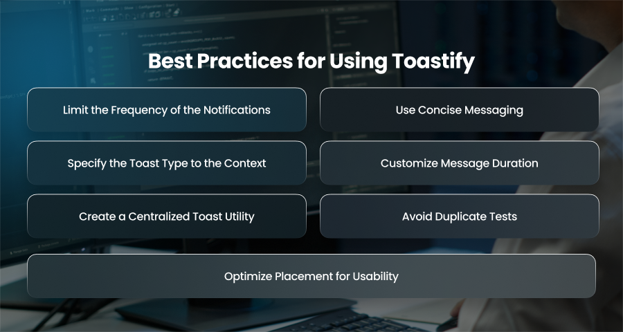
Limit the Frequency of the Notifications
It’s important not to overwhelm your users with constant notifications. Even though it’s tempting to provide feedback to every user action but not every event needs a toast. Moreover, use toast notifications selectively for events that truly require user attention or system updates. Additionally, using toasts excessively might desanitize users or make the app appear cluttered. Toast messages should only be displayed when they truly improve the user experience.
Use Concise Messaging
Your communications should be clear and succinct. Additionally, a toast should convey the information in a single glance, preferably in a few words or a brief sentence. Additionally, you should steer clear of jargog. Instead, you should use straightforward language that makes the action’s outcome obvious.
Specify the Toast Type to the Context
React Toastify offers various toast types like success and info. Using the right type for each message helps users quickly interpret what the toast means. For example, a green success toast indicates something went well. On the other hand, a red error toast signals a problem.
Customize Message Duration
The duration that a toast stays on the screen should be tied to how critical the message is. Minor updates can auto close after a couple of seconds. However, important errors can need more time so the user can read and understand them fully. Also, for messages requiring user action, you can disable auto close altogether and allowing the user to manually dismiss the toast.
Create a Centralized Toast Utility
Centralizing your toast logic into a single utility file will help you maintain a clean and uniform codebase. By implementing this, you can make sure that all alerts have the same look and feel and prevent having to configure toast across several components. Furthermore, a toast utility can include reusable functions like notifysuccess() and notifyerror() pre configured with consistent timing and position.
Avoid Duplicate Tests
Displaying the same toast repeatedly in a short span can create a frustrating experience. Fortunately, React Toastify allows you to assign IDs to toast and check if a toast is already active before displaying another. Hence, this can help prevent duplicates, especially in applications with frequent updates or actions that can trigger multiple identical notifications in a row.
Optimize Placement for Usability
Your user flow and UI architecture may dictate where the toast appears on the screen. Furthermore, the top right position is the default and usually the most anticipated; nevertheless, other positions, such the bottom left or center top, can make more sense depending on the sort of message.
Final Words
A quick and easy method for adding toast notifications to React apps is through React Toastify. Additionally, with a simple setup and thoughtful customization options, it may improve user input without overwhelming your interface. When used according to best standards, it also creates a seamless and sophisticated user experience across all devices.


